Website Update: Newly Approved ASJA Homepage

Any organization building a new website quickly learns that creating an engaging homepage is mission-critical to the project’s success. In fact, that new homepage may be critical to the organization’s continued success, too. A well-designed, inviting homepage can make all the difference in convincing casual visitors to spend time on the site or, in ASJA’s case, apply for membership.
But just being eye-catching isn’t enough. Clarity and an intuitive design tell visitors not only what an organization does but what its value proposition is. This sounds like a tall order, but the new ASJA website’s homepage is set to deliver.
In March, the ASJA Board of Directors took a critical step in the massive, ongoing website overhaul project by approving a new homepage design. The new design will allow the organization more flexibility as it promotes upcoming events as well as available services and resources more effectively—with the goal of using the redesigned website to attract new members while serving existing members.
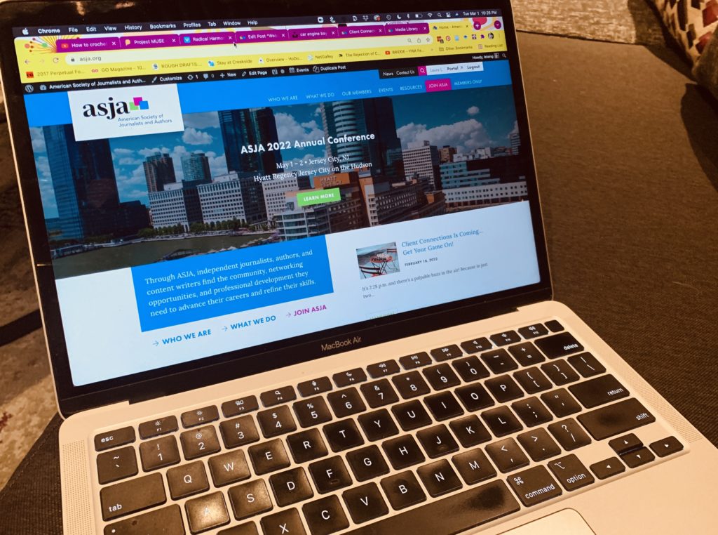
Note: please click here to see the new homepage design and follow along as you read the news below.
How We Got Here
For more than six months, the website committee has collaborated with Toronto-based website developer Think33 to create a bold new website. Think33’s directive: Create a fresh, vibrant look that reflects the energy and professionalism that current and aspiring members bring to the organization.
They were also tasked with developing a modular design that will allow the flexibility to move or insert blocks of text and graphics as needed. As a key part of ASJA’s value proposition, the “Resources for Writers” section, informally known as the education hub, also needed to shine.
Last month, the Board reviewed three homepage layouts during their monthly meeting. Each design contained the same six elements:
- How and why to join ASJA
- Resources
- Member testimonials
- Writer finder
- News
- Events
Each design also offered its own feel and focus. For example, the first design focused on the features of ASJA membership using a minimalist design vocabulary. The second design took that a step further and focused on ASJA members and the benefits they derive from membership. Finally, the third design told the story of what ASJA members actually do using the boldest, brightest colors of the bunch.
The Board offered directional feedback on concepts and priorities. The website committee asked Think33 to create an updated version of “Story,” the board favorite, and presented that at a special meeting the following week.
Board members received all the layouts, detailed commentary, and a ballot via email after that meeting and unanimously chose the revised version of Story, which also happened to be the committee’s recommendation. This decision establishes the new website’s look and feel.
Serving Both Potential and Existing Members
Analytics show that most visitors to the current website are current ASJA members. With new member enrollment stagnating in recent years, this is understandable but unsustainable. For ASJA to thrive, new prospective members need to seek us out, discover who we are, and then click the “join” button—a process that is not happening frequently enough. This revised homepage is designed in a fashion that when potential members visit, they quickly have access to the organization’s benefits and resources and submit an application.
Additionally, the new homepage should be equally adept at meeting the needs of our current members. Since most members use the homepage mainly as a jumping-off point for other sections, such the events or resources sections, the new homepage highlights these sections both as featured items and on the navigation bar, making it doubly easy to find what one is looking for.
We expect the new homepage to serve as a strong membership recruitment tool even as it improves the membership experience of current members.
Recent Progress Toward the New ASJA Website
The approval of the new homepage look and feel is the third major aspect of the organization’s website redesign that’s been completed to date.
Last fall, the ASJA board voted on and approved an improved sitemap for the new iteration of the website. This enhanced version of the website’s top navigation bar portions the information into “buckets,” allowing visitors to easily find the information they’re seeking.
In February, the organization announced the launch of a new ASJA logo. This new design, which began with a strategic focus on what the organization represents to current and prospective members, incorporates three multicolored squares to reflect that members can be journalists, authors or content marketing writers. The new logo has already been incorporated into ASJA’s publications, member communications and, obviously, the upcoming new website.
Currently, work is ramping up on a number of fronts. These include:
- Finalizing the homepage copy and layout, including photo sourcing
- Designing additional pages using the approved homepage as a model
- Creating a workable process for writing copy for the site’s 100-plus pages
- Early-stage implementation of the new association management software
- Building and testing the member profile functionality
- Assembling a content curation team to decide which existing educational resources will come with us to the new site
We’ll be back next month with more website updates. Thanks for reading!